A Beginners Guide to PowerBI
Introduction
I bet you have seen those clips from movies, a bunch of corporate guys in a meeting where they are all looking at some pie charts, bar graphs, line graphs, scatter plots and whatnot watching it on a big screen, while they all plan to plot a twist. Ever questioned what exactly they are looking at? Well, that’s what we are going to explore.
Alright, so we are all aware of how everyone is saying “Data is King”, “Power of Data” and “We need data”!! Okay, the last one was unnecessary, but yes that’s one thing most companies say all day long. But again what is the use of this data? Welcome to the beginners guide to PowerBI,The way to unlock the meaning behind your data.
PowerBI by Microsoft is a tool that helps us turn raw data into insightful, interactive visualizations. And those flashy piecharts and bar graphs on the big screen I was talking about earlier is called a dashboard. Data Science and Data Analytics today are so widely known and appreciated as career choices because what they do is work with data. They analyze it, create dashboards, and get important insights out of it and this is how businesses are making the right decisions today!
What is PowerBI?

PowerBI is a Business analytics tool that is now being used widely to get insights from your data. It connects to so many data sources and points that importing any form of data has now become a piece of cake. More to it once data is imported it can be simplified, data can be prepared for further operations, and drive ad-hoc analysis. Now once the data is analyzed it can be converted into beautiful reports and published as dashboards for your organization to be viewed on web or mobile devices.
Importance of Data Visualization
Understanding the meaning of huge amounts of data is essential as our world today, as per the population is driven by information, Basically data! Making sense of complicated data, seeing patterns, and finding smart decisions are all enhanced by data visualization. In this sense, PowerBI wins by offering tools that turn data into interesting visual narratives.
Who Can Benefit from PowerBI?
Anyone who handles data has the benefit of using PowerBI. This includes IT specialists, business analysts, data scientists, and even managers who need to visualize and analyze data in order to make strategic judgments.
Getting Started with PowerBI
System Requirements
Although you may find this information on Microsoft’s official website for powerBI, we will simplify it for you. So before you start, Make sure your system runs on Windows 10, Windows 8.1, Windows 8, Windows 7, Windows Server 2012 R2, Windows Server 2012, or Windows Server 2008 R2. All the above-mentioned systems support the PowerBI application. Also, make sure you have at least 2GB of RAM for initial learning purposes if you are going to analyze large datasets more the RAM merrier the experience.
Installing PowerBI Desktop
- Go to the PowerBI website.
- Click on “Download” and choose “PowerBI Desktop”.
- Follow the installation instructions.
Navigating the Interface
Once installed, open the desktop application, we strongly reccomend to follow our beginners guide to PowerBI. You’ll see that you have seen this somewhere! Hmmm! Where though? Guys, it’s just a pumped-up version of Microsoft Excel, Not exactly but it looks similar to Excel and has that ‘Obvious Microsoft Product’ look and feel. The main and differentiating components include the Home, Data, and Model views.
Connecting to Data Sources

Supported Data Sources
Well, the creators of Microsoft obviously thought, ‘Connect whatever data source you like’ ranging over a wide array including Excel, SQL Server, Azure, and web services like Google Analytics and Salesforce.
How to Connect to a Data Source
- Click on “Get Data” on the Home ribbon.
- Select your data source type.
- Follow the prompts to connect and import data.
Data Import vs. Direct Query
You can use PowerBI to import data into PowerBI Desktop or to connect to data in real time using Direct Query. For smaller datasets, importing works well, but for larger databases that change dynamically like those candle graphs you see in the stock market data, direct query works best.
Transforming Data in PowerBI
Introduction to Power Query Editor
Power Query Editor is where you can clean and transform your data. It allows you to perform actions like filtering rows, changing data types, and merging tables.
Basic Data Transformation Techniques
- Filtering Rows: Remove unnecessary data by filtering rows based on criteria.
- Changing Data Types: Just like in Excel, if the data is not in the right format it can confuse the app, so make sure the data type is formatted correctly.
- Removing Duplicates: Again! Similar to MS Excel clean your data by removing duplicate values.
Advanced-Data Transformation Techniques
- Merging Queries: Let’s say you need data from multiple sources you can combine it.
- Pivoting Columns: Operates similar to a pivot table in Excel, transforming data from rows to columns and vice versa against a pivot point.
- Creating Custom Columns: Use Power Query Editor to create new columns based on requirements and calculations.
Building Your First Report
Creating a New Report
- Click on “File” > “New”.
- Import your data or connect to a data source.
- Start building your report by dragging fields onto the report canvas.
Adding Visualizations
This is where the magic happens. To create the perfect visuals, just drag and drop fields into the visualization window and watch as the charts, graphs, maps, and other visualizations are generated in PowerBI. We have stated only a few here as this is a beginners guide to PowerBI.
Customizing Visualizations
Now its time to make the dashboard your own! Meaning, adding a little flare to it, Glitter & sparkles, a color scheme maybe, you can improve your visualizations by altering the labels and other variables too. To try out the multiple customization options, use the “Format” tab.
Understanding PowerBI Dashboards
Let’s See How Reports and Dashboards Differ.
To sum it up into a few sentences, Reports include detailed data visualizations similar to for example an ECG report where your heart activity is shown in a graphical format, while dashboards are collections of visuals from different reports, like the complete medical file that shows your overall health.
Creating a Dashboard
- Publish your report to PowerBI Service.
- Select visuals to pin to your dashboard.
- Arrange and resize visuals to create a cohesive dashboard.
Sharing Dashboards
Share your dashboards with colleagues by granting access through PowerBI Service. You can also embed dashboards in applications or websites. You can only share live, i.e realtime dashboards with licenced and paid versions of the app and since this is only a beginners guide to PowerBI we recommend you to learn it thorughly and then go for the paid versions.
Introduction to DAX (Data Analysis Expressions)
What is DAX?
DAX is a formula language used in PowerBI to create custom calculations. It’s similar to Excel formulas but designed for data modeling and analytics.
Basic DAX Functions
- SUM: Adds all the numbers in a column.
- AVERAGE: Calculates the average of a column.
- COUNT: Counts the number of values in a column.
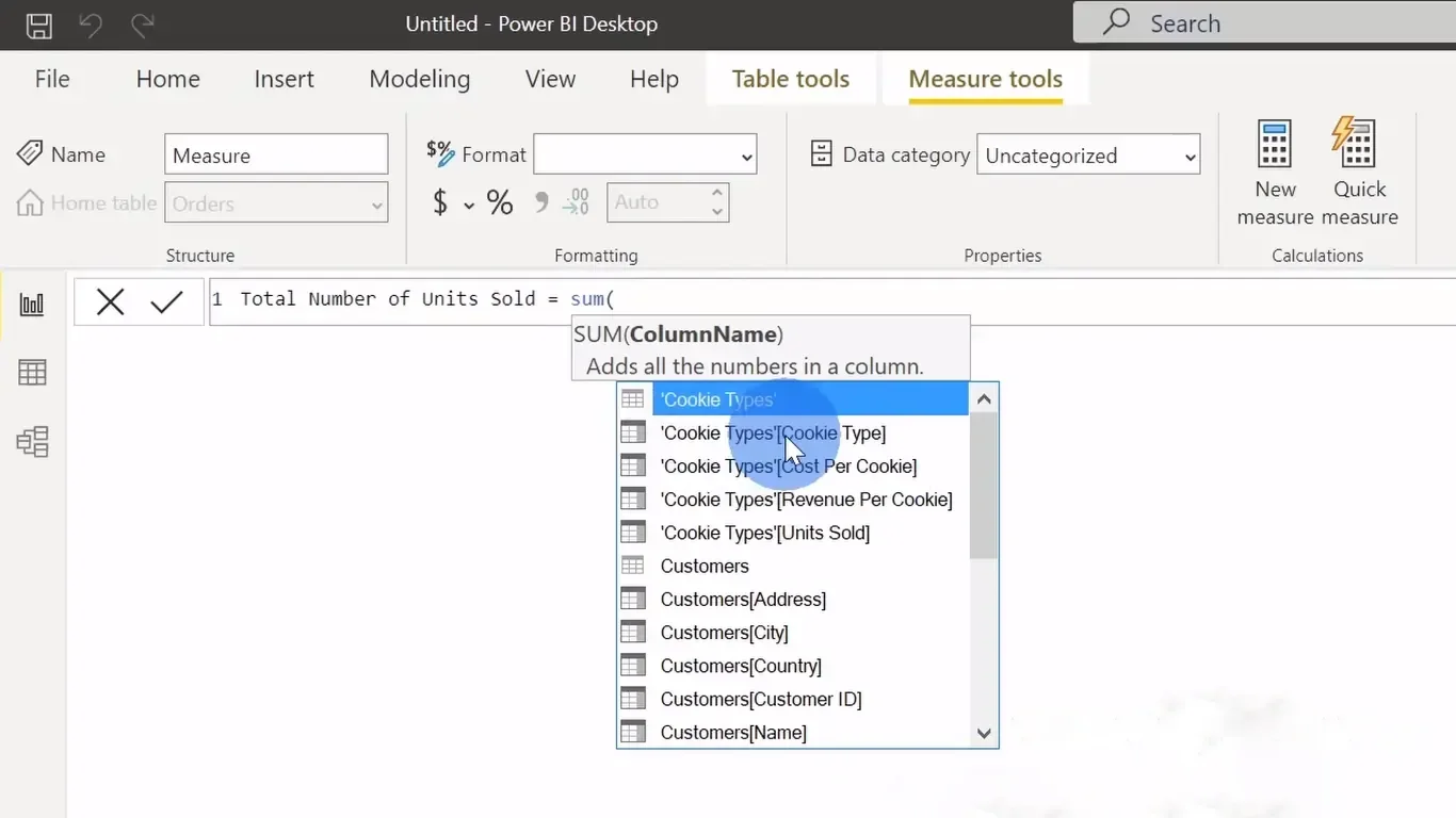
Writing Your First DAX Formula
Let’s say you own a business and you want to create a report to see your sales figures. Now let’s consider that you have already imported your sales data into PowerBI and done with data cleansing and transformation activities. Now you need to analyze the data further to find the total of your sales amount. Following the steps below would help you do exactly that.
- Click on “Modeling” > “New Measure”.
- Enter your DAX formula (e.g., Total Sales = SUM(Sales[Amount])).
- Use the measure in your reports.
Advanced DAX Functions
Time Intelligence Functions
Now let’s say that you need to sort and compare your sales data according to the year, here these functions are used to calculate date and time-based data, for example DATESYTD (year-to-date) and SAMEPERIODLASTYEAR (same period as last year).
Filter Functions
It is as simple as it sounds, you basically apply a filter. Filter functions allow you to control the data included in your calculations. Examples include FILTER, ALL, and CALCULATE.
Aggregation Functions
Aggregation functions let you analyze and interpret data patterns and trends more effectively by condensing huge datasets into digestible summaries. For example SUMX, AVERAGEX, and COUNTX.
Enhancing Reports with Advanced Visualizations
Using Custom Visuals
PowerBI supports custom visuals from the Microsoft AppSource. These visuals can be added to your reports to improve your data presentation. With this beginners guide to PowerBI we recommend you to get comfortable with basic visualizations and keep trying new ones as you upgrade.
Creating Interactive Reports
you can dynamically filter, navigate, and analyze data with PowerBI’s slicers, drill-throughs, and bookmarks, which improves user experience and data exploration overall. So when you change or select one field, the dependent fields also change in the reports showing you exactly how one particular operation is performing and its impact on the dependent fields.
Best Practices for Data Visualization
Make sure the PowerBI report or dashboard is clear and readable by selecting the right chart types, keeping formatting consistent, and minimizing clutter. By following these guidelines, you can communicate ideas effectively and improve the readability of your visualizations.
Publishing and Sharing Your Work
Publishing to PowerBI Service
- Save your report in PowerBI Desktop.
- Click on “Publish” and select your workspace in PowerBI Service.
Sharing Reports and Dashboards
Let’s say you don’t want other employees in your organization to make changes to your Report or dashboard. In this case, grant access to others by sharing links or inviting users through PowerBI Service, here you can control permissions to ensure user capacity and data security.
Collaboration Features
Now if someone in your organization wants to share some ideas or tips or even leave comments on a particular thread in PowerBI, collaboration features like shared workspaces, comment threads, and integration with Microsoft Teams can help them do exactly that.
PowerBI Pro vs. Free Version
Features of PowerBI Free
The free version of PowerBI offers robust features including data visualization, sharing reports with up to 1GB data capacity, and basic collaboration tools. With this beginners guide to PowerBI we intend to give you the basic information you need for the moment.
Additional Features in PowerBI Pro
PowerBI Pro includes advanced sharing and collaboration features, increased data capacity, and the ability to embed reports and dashboards.
Deciding Which Version is Right for You
Choose PowerBI Free for personal use or small projects. Opt for PowerBI Pro if you need advanced features, larger data capacity, and extensive collaboration tools.
Mobile Access and PowerBI
PowerBI Mobile App
You can view and manage your reports and dashboards while on the go with the PowerBI Mobile app. Devices running Windows, Android, and iOS can use it.
Creating Mobile-Friendly Reports

Most of us use smartphones to access work on the go, carrying a laptop on the shop floor isn’t convenient most of the time, so you can design your reports with mobile viewing in mind. You can use PowerBI’s mobile layout view to arrange visuals for smaller screens.
Real-Time Data on Mobile
It is important to stay updated with real-time data alerts and notifications on your mobile device, so to ensure you never miss critical updates you can set how frequently your data is updated in your reports.
PowerBI and Excel Integration
Importing Excel Data into PowerBI
As I have mentioned earlier PowerBI is a pumped-up version of Excel. So if you have already done your basic data manipulation in Excel and want to import the same into PowrBI, simply click “Get Data” and choose Excel as your source to import your Excel data into PowerBI. Tables, ranges, and even pivot tables can all be imported.
Using PowerBI Features in Excel
Sooner or later PowerBI is going to replace Excel, Many PowerBI features like data visualization and data modeling can be integrated directly into Excel through the PowerBI Publisher add-in. Don’t tell me this isn’t the first step in that direction!
PowerBI Publisher for Excel
To connect gaps between Excel and PowerBI, you can pin Excel elements like ranges, charts, and tables to PowerBI dashboards using PowerBI Publisher for Excel.
Troubleshooting and Support
Common Issues and Solutions
Encountering issues? Common problems include data refresh failures, visualization errors, and connectivity issues. Check the PowerBI documentation and community forums for solutions.
PowerBI Community and Resources
Both official and unofficial online forums and groups exist. To gain access to blogs, user groups, and forums, sign up for the PowerBI community. The community is a great place to learn, get advice, and solve problems.
Official Microsoft Support
For more serious issues, Microsoft offers official support through its website. You can access tutorials, troubleshooting guides, and contact support.
Conclusion
PowerBI is an amazing tool that completely changes the way you work with data. PowerBI provides a complete data analytics solution, ranging from laying down connections with data sources to producing eye-catching visuals and publishing findings. Try out PowerBI now to realize your data’s full potential.
FAQs
1) Is PowerBI difficult to learn for beginners?
A) PowerBI is designed to be user-friendly, with an intuitive interface and plenty of resources to help beginners get started. With a bit of practice, you’ll be creating reports and dashboards in no time.
2) Can I use PowerBI for free?
A) Yes, PowerBI offers a free version with many powerful features. However, for advanced sharing and collaboration, you might need PowerBI Pro.
3) What data sources can I connect to in PowerBI?
A)PowerBI supports a wide range of data sources, including Excel, SQL Server, Azure, and various online services like Google Analytics and Salesforce.
4) How can I share my PowerBI reports and dashboards?
A) You can share reports and dashboards through PowerBI Service by granting access to other users. You can also embed them in applications or websites.
5) What is DAX, and why is it important?
A) DAX (Data Analysis Expressions) is a formula language used in PowerBI for creating custom calculations. It is crucial for data modeling and allows you to perform complex data analysis.

